
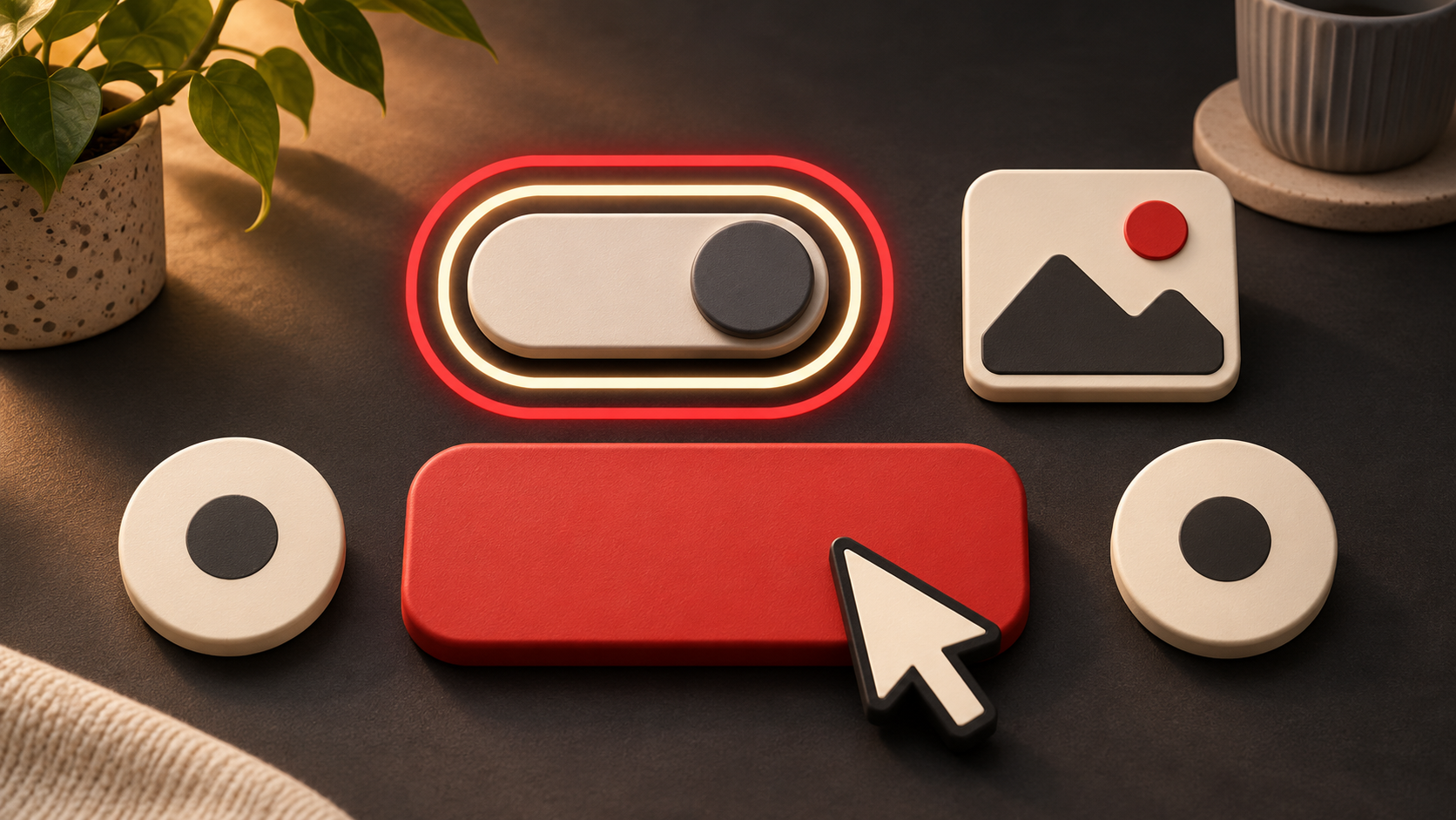
Accessibility is often discussed as a large compliance project. It is also shaped by small interface decisions made every day. A visible focus indicator, a larger tap target, a clear label or the right text alternative can change whether someone completes a task or leaves it.
These choices help people with disabilities, and they often make an experience easier for everyone using a small screen, a keyboard, a shaky connection or a distracting environment.
Make the current position visible
Keyboard users need to see which control is active. Removing the browser’s focus outline without providing a strong replacement can make a page feel like a room with the lights off.
WCAG 2.2 includes guidance on focus appearance. The detailed W3C explanation describes a visible indicator with enough area and a contrast change of at least 3:1. A solid outline around the component is one of the simplest approaches.
The design opportunity is not to hide focus because it looks technical. It is to make focus feel intentional within the visual system.
Test the page with the Tab key. If you lose track of where you are, the interface is asking the user to guess.
Give important controls enough room
Small targets are difficult to activate accurately. This affects people with limited dexterity, tremors or alternative pointing devices. It also affects anyone using a phone with one hand on a moving taxi.
WCAG 2.2’s minimum target-size criterion uses 24 by 24 CSS pixels, with defined exceptions including sufficient spacing. The W3C also notes that larger targets can still be more usable, especially for important controls.
Do not treat the minimum as a design goal. Use generous target areas for actions such as Continue, Pay, Save and Close. Remember that the clickable area can be larger than the visible icon.
Describe the purpose, not every pixel
Alternative text should help someone understand what an image contributes. That does not mean describing every decorative detail.
The W3C’s decision tree asks what role the image plays. If an image contains information that is not available elsewhere, the alternative should communicate it. If an icon performs a function, describe the function. If an image is decorative and adds no information, an empty alternative can prevent unnecessary noise.
Context matters. The same photo may need a different description in a product catalogue, a news article and a decorative banner.
The useful question is: what would the reader miss if the image were unavailable?
Write labels that explain the next step
“Click here” and “Learn more” make sense only when the surrounding context is visible and easy to interpret. Clear labels reduce uncertainty for screen-reader users, people scanning a page and anyone trying to recover from an error.
Name the action or destination. Use “Download the pricing guide”, “Review your order” or “Contact the studio” when that is what will happen.
Error messages need the same care. “Something went wrong” confirms a problem but gives no recovery path. Say what happened, what information is still safe and what the person can do next.
Accessibility belongs in ordinary review
Teams do not need to wait for a major redesign to improve these details. Add a few checks to normal design and release work:
- Navigate the main journey with a keyboard.
- Check focus against every background it crosses.
- Review tap targets and spacing on a small screen.
- Confirm that controls have clear names.
- Decide whether each image needs useful alt text or an empty alternative.
- Test errors and recovery, not only the happy path.
Automated tools can identify some issues. They cannot decide whether a label is understandable, an alternative captures the purpose of an image or a recovery path makes sense to a customer.
Small improvements compound
Accessibility is not a layer added after design. It is part of how a product communicates state, action and meaning.
The benefit of these small decisions is cumulative. Clear focus helps navigation. Larger targets reduce mistakes. Useful alternatives preserve meaning. Better labels reduce uncertainty. Together, they make the experience easier to trust.
Want to make an existing digital journey clearer and more inclusive? Explore Clekzo Studio and see how we approach practical product and UX improvements.